Logo Usage Guidelines
Logo
The logo lockup is available in three color schemes: blue, black and white. The white version should be used on dark backgrounds, while the black version should be used on light backgrounds. The blue version works on both light or dark backgrounds. There is one primary lockup colorway and two secondary lockup colorways available.
Primary Lockup

|
Secondary Lockups

|

|

|

|
|
Clearspace
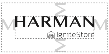
To ensure that the logo is clearly visible, use the width of the M letterform within the HARMAN corporate logo as a clearspace benchmark on all sides.

|
App Icon
In cases where the Ignite brand has already been established, we simply use the icon on its own. While the icon can exist without the wordmark, the wordmark should never exist without the icon.
 |
Glyphs
The glyphs are available in four color schemes: white, blue, grey, dark grey and gradient. They must be used on backgrounds that have sufficient color contrast.
Badges
Two kinds of badges are available for use, one with a dark background (black) and one with a light background (white).

| 
|
|
Pattern
The pattern consists of light grey waves on a dark background.

Typography
The typeface used for the Logo should be Kanit Extra Light.

Colors
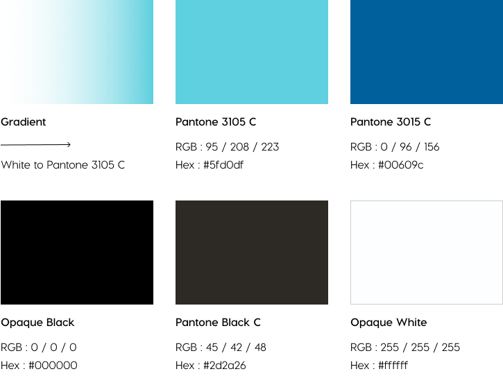
The color palette of the Ignite brand mainly focuses on shades of blue (light and dark) and neutrals (black, dark grey, and white). A gradient is also present, which goes from left to right and from white to blue.
