Ignite Templates
Ignite Store provides the following templates in addition to the support to the google backed open source templates available. These components and templates are the foundation of how customers will use your app.
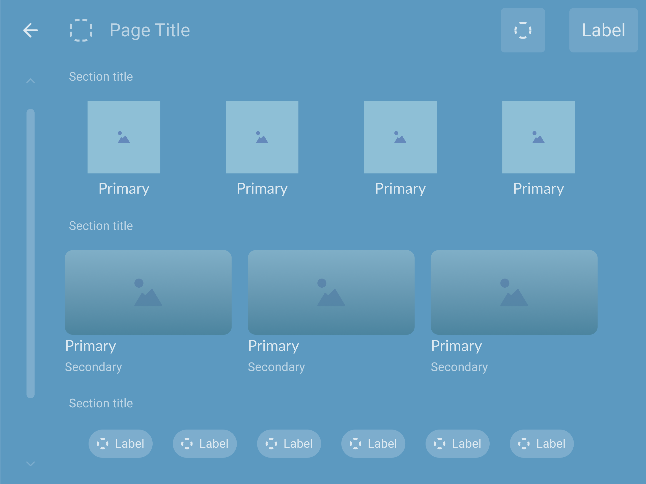
Ignite List Detail / List
| Support to Ignite Row.
The Details on RHS is optional making it equivalent to List when no details are provided.
The RHS can be a card or list component. | 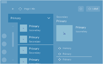 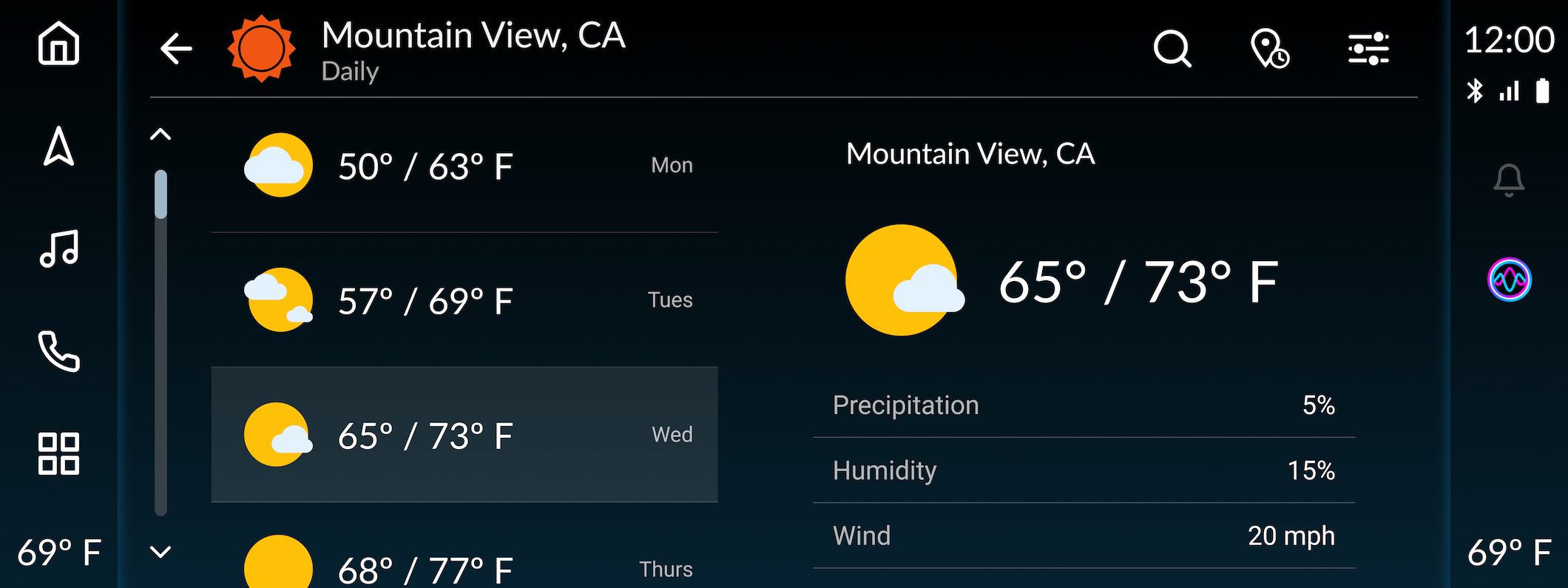
|
Ignite Web View
| Templated Web View to display web content.
| 
|
Ignite Route Overview
Template ( Place Overview)
| Provides more details for the POI shown.
Google Route Preview can show more than one route, Ignite Route Overview can show only one route. | 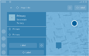
|
| Ignite Explore | Template to categorize and present data - helpful for POI apps. | 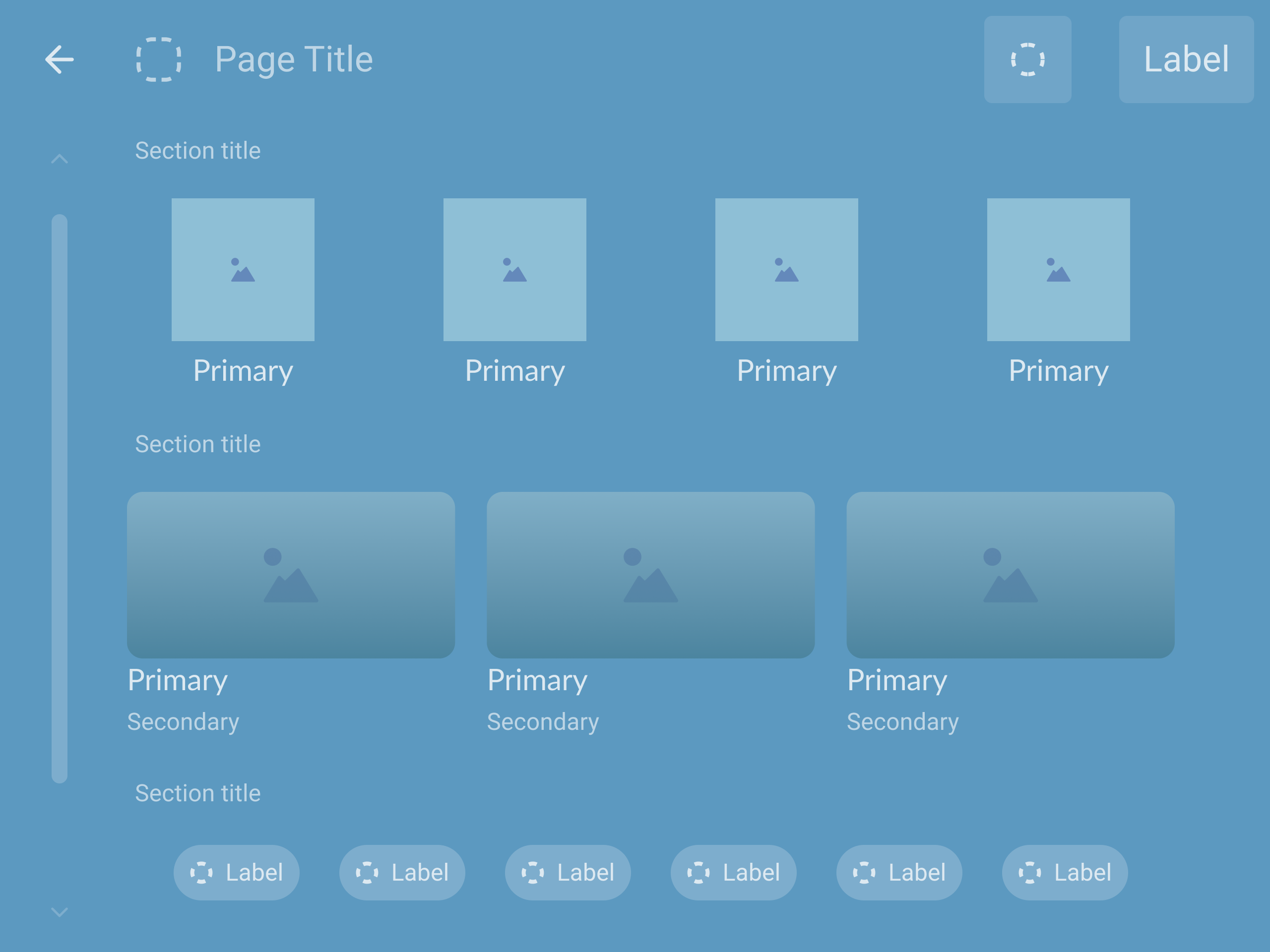
|
| Ignite Toast | Up to Two lines and an icon/image. |  
|
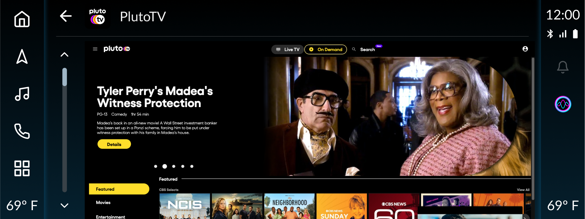
Ignite Video
| Display streaming video content |  
|
The above templates are in addition to the open source google templates avaibale for AAOS applications.
Ignite Template Documentation
Ignite List Details Template
Design Guidelines
How to use
The ListDetails template is used for presenting additional information about a selected List Item Rows. The list can be updated using the IgniteChooser (optional) and display relevant additional data in the secondary panel.
Includes
- Top Bar
- Ignite Chooser (optional)
- Header Row
- List Item Rows
- Buttons
- Card Type 1 / Card Type 2/ List
Design Constraints
Header Content
Headers are used in most templates, and can be customized for branded experiences. The header typically includes informational content and / or contextual actions that correspond with the contents, list item(s), or card information.
Smaller Displays
When used in smaller displays, information will be condensed and prioritized based on the order delivered from the third-party provider. Supporting visual may not be shown depending on screen size.
Default Actions
Services and apps from the same domain may have additional requirements for what actions and information they are required to present. For example, POI apps should always present an option to navigate as the primary action.
Developer Requirements
- MUST provide a content title in the header
- MUST provide a content title in the Top Bar
- MAY include a chooser component (Optional)
- MUST provide list content on the left
- MUST included details on the right (Card Type 1 / Card Type 2 / List
- MAY potentially Include multiple views for the "expanded content details" depending on App / Service features example - every list item can be associated with an action which refreshes the content on the right.
Design Guidelines
How to use
The Ignite Web View Template is used as a means to display web-based content. This template is only visible in Park Mode.
Includes
- Top Bar *
- Content Area
- Designated for Web View Content
* Visibility of Top Bar can be controlled in Web View and Video & Games Templates
Design Constraints
Header Content
Headers are used in most templates, and can be customized for branded experiences. The header typically includes informational content and / or contextual actions that correspond with the contents, list item(s), or card information.
Smaller Displays
When used in smaller displays, information will be condensed and prioritized based on the order delivered from the third-party provider. Supporting visual may not be shown depending on screen size.
Default Actions
Services and apps from the same domain may have additional requirements for what actions and information they are required to present. For example, POI apps should always present an option to navigate as the primary action.
Developer Requirements
- MUST provide details for the Top Bar
- MUST provide a web url to load content in the content area
Template Examples
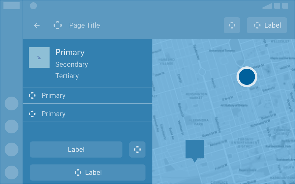
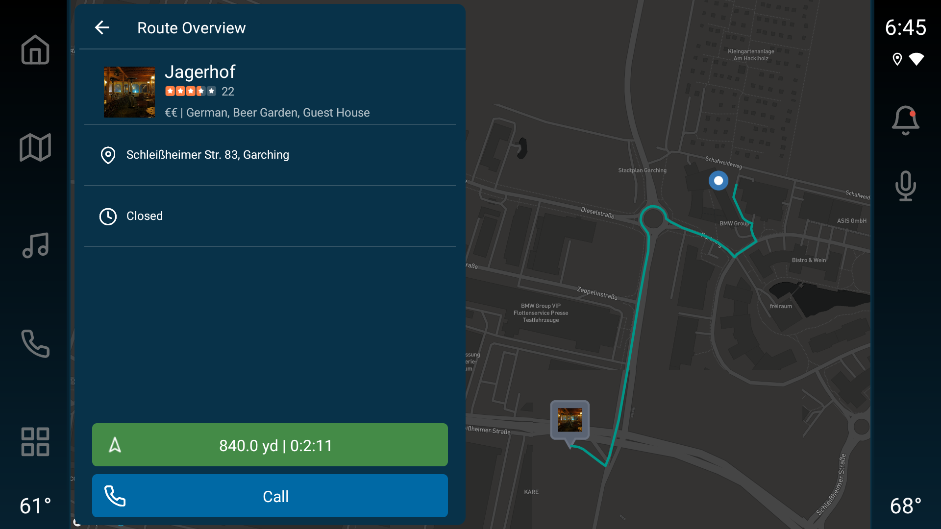
Design Guidelines
How to use
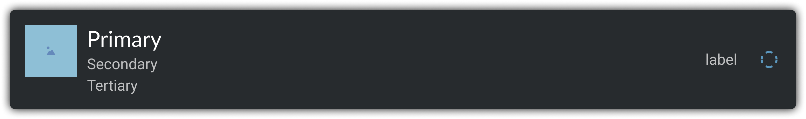
The Overview template is designed to provide a summary of useful information while providing customizable actions. The left side can have product details and customized actions with the right side supporting a route preview and location information.
This template is useful for providing more details about a single location on the map.
(Map will be provided by the OEM.)
Includes
- Top Bar
- Header (Details Info - Image, Primary Title text and two secondary text)
- List items
- Button rows anchored to the bottom of the screen (Upto 2 rows)
- "Primary Action" which is always Navigate button.
- Additional Action (Upto 2)
- Supporting Map Information
- Location Marker Image
Design Constraints
Header Content
Headers are used in most templates, and can be customized for branded experiences. The header typically includes informational content and / or contextual actions that correspond with the contents, list item(s), or card information.
Smaller Displays
When used in smaller displays, information will be condensed and prioritized based on the order delivered from the third-party provider. Supporting visual may not be shown depending on screen size.
Default Actions
Services and apps from the same domain may have additional requirements for what actions and information they are required to present. For example, POI apps should always present an option to navigate as the primary action.
Developer Requirements
- MUST provide details for the Top Bar
- MUST provide a Header Row that may contain
- Must provide Title
- May provide an image and/or text in secondary row
- May provide text in tertiary row
- MAY provide additional rows of information (1 - 2 rows)
- MUST provide 1 primary action (Button)
- MAY provide up to 2 additional actions (in a single row)
- MUST provide coordinates of the POI (on the map)
- MUST provide location marker
Template Examples
Design Guidelines
How to use
The Explore Template is very flexible template to represent a wide variety of data. The design flow represents a list with the support to a number of Ignite Components.
Includes
- Top Bar
- One or many Ignite Rows
- Row of Card Small (0-n)
- Row of Card Large (0 - n)
- Row of Badge (0 - n)
- List Item (Icon + Label + Sub-label)*
*May be used to divide the individual sections of content)
Important Notes
- The total Limit of rows visible is defined by the OEM
- Number of Cards in a single row is limited by OEM and also depends on screen size specs.
Examples:
Small Screens - Small cards may be limited to 3 and Large Cards may be limited to 2 by an OEM
Large Screens - Small cards may be limited to 4 and Large Cards may be limited to 3 by an OEM
Design Constraints
Header Content
Headers are used in most templates, and can be customized for branded experiences. The header typically includes informational content and / or contextual actions that correspond with the contents, list item(s), or card information.
Smaller Displays
When used in smaller displays, information will be condensed and prioritized based on the order delivered from the third-party provider. Supporting visual may not be shown depending on screen size.
Default Actions
Services and apps from the same domain may have additional requirements for what actions and information they are required to present. For example, POI apps should always present an option to navigate as the primary action.
Developer Requirements
- MUST provide a details for the Top Bar
- MUST include a minimum of one Ignite Rows
- Row of Card Small (0-n)
- Row of Card Large (0 - n)
- Row of Badge (0 - n)
- List Item (Icon + Label + Sub-label)*
*May be used to divide the individual sections of content)Template Examples
Design Guidelines
How to use
The Ignite Toast Template provides a brief message about the current status or informational context about any actions that may be required and/or feedback in response to an action that has taken place.
Includes
- Image / Icon (Optional)
- Message
- Action Button (Optional)
- Right Side Contextual Content (Optional)
Developer Requirements
- MAY include Image / Icon
- MUST include Message
- Proactive to actions required
- Reactionary to actions taken
- MAY include Action Button to enable the user to react to toast message
- MAY include supportive Sub-Context (Right Side)
Template Examples
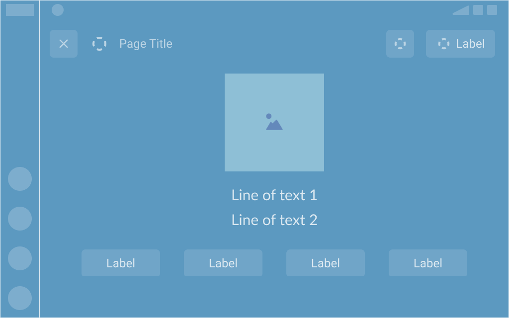
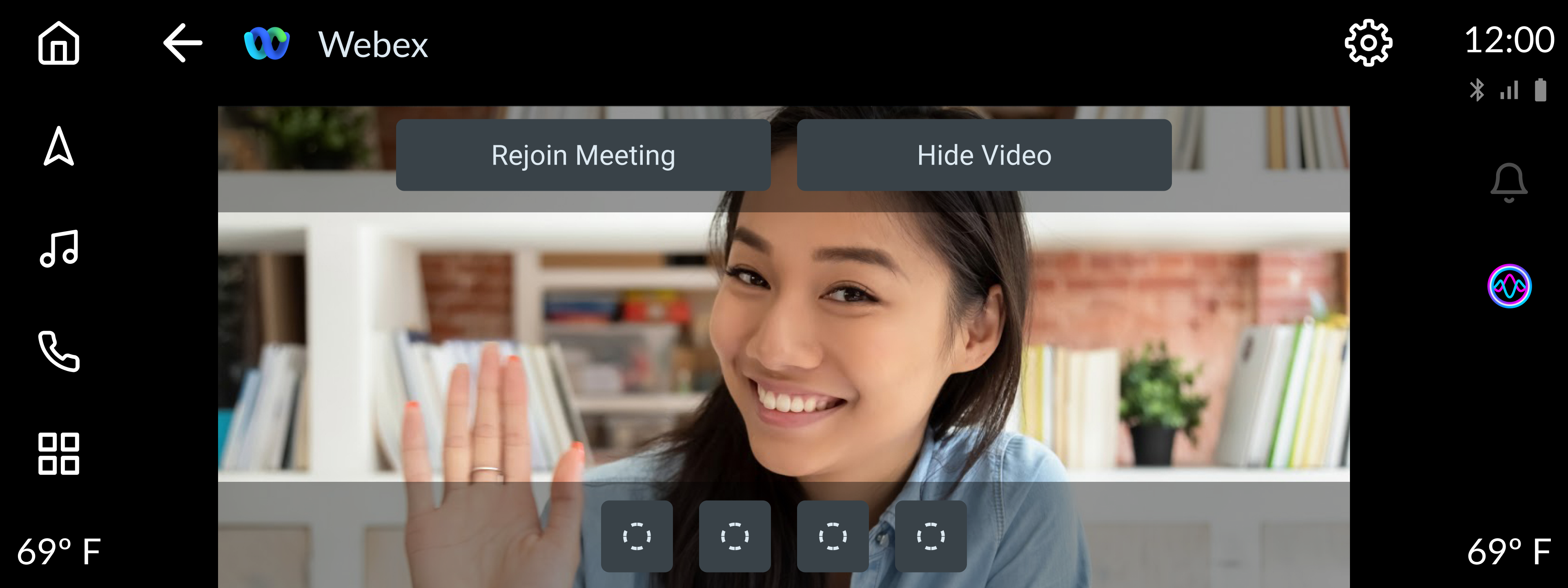
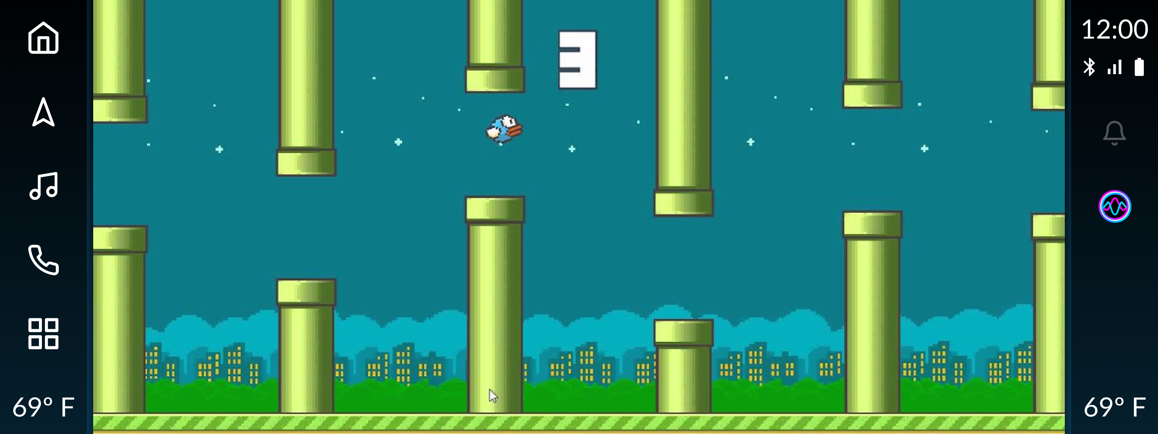
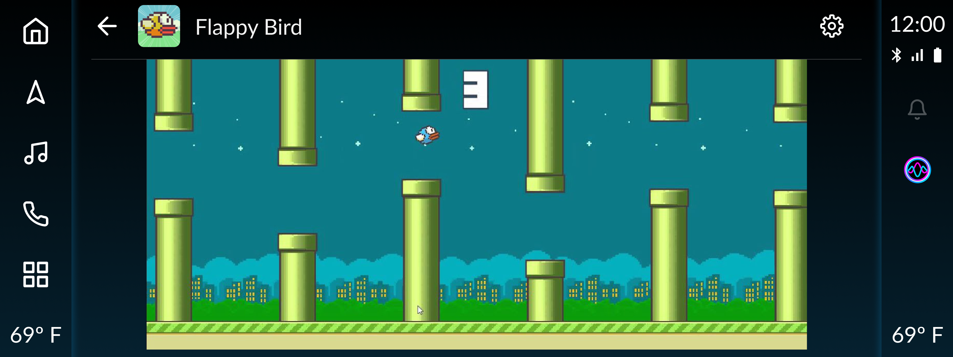
Design Guidelines
How to use
The Ignite Video Player template is designed for displaying multimedia content to the user while in parked mode, while providing customizable in context actions, and enables the user to display and hide media content based on preference and driver safety.
While this template is primarily used for video/media use cases; it can also be leveraged for use in communication app use cases where the video/media is hidden or not required.
Includes
- Top Bar *
- Media viewer
- Up to 2 lines of text (optional)
- Button row
- 1 button min / 4 button(s) max
* Visibility of Top Bar can be controlled in Web View and Video Templates
Developer Requirements
- MUST provide a content title in the header
- MAY provide an image or icon related to content
- MAY include a button in the header to display/hide media content
- MAY provide a media viewer
- MUST disable the media while vehicle is in drive mode
- MAY include up to 2 lines of text
- MUST provide 1 button and up to 4 button(s) max
Template Examples