Ignite Components
The Ignite templates have a set of components that can be customized to display your apps data and actions. Each component has constraints and guidelines to keep designs consistent and usable across various templates. These components are the foundation of how customers will use your app.
Used in: Top Bar, Pane, and Message templates, or on the Action Strip in any template.
How to use:
You can supply text and icon image.
Important Note:
OEMs can apply their own colors, and choose whether or not to use the assigned colors you supplied in you AAOS versions of your app.
Variations:
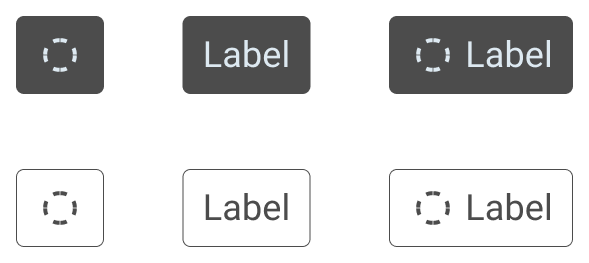
- Icon Only
- Label Only
- Icon + Label Only
What can change:
* May be OEM controlled
Guidelines:
Buttons can be modified to allow for a custom themed user experience. Keep the label short -- limit the labels to a maximum of 16 characters to avoid truncation. Its recommended that even shorter labels are used in navigational mapping.
Examples:


Used in: Frequently used components with lots of flexibility, rows are commonly used as list items to convey search results, actions, and information pertaining to the user's current contextual view.
How to use:
Rows can be used in Lists, Place lists, and Pane templates.
Variations:
A combination or multiples of any of the following
- Primary Text
- Image + Primary Text
- Text (Primary + Secondary + Sublabel)
- Card
- Badge
What can change:
- Primary Text (mandatory)
.
- Icon or Image (optional)
- Secondary Text (optional).
- Sublabel Text (Optional)
- Associated Action with the Row
- Other Ignite Components (viz. Badge or Card (Type-Small, Large))
Guidelines:
Rows can also be customized to create a variety of list types - such list types include: lists with data, lists with images, as well as actions. Its preferred that the text length is not too long as Text longer than the display limit (set by OEM) will be truncated by the system. Different OEMs may have different text limits.
Examples:


Ignite Badge
Used in: Ignite Row, Explore
How to use:
Use badges to bring quick selection and filtering options to the forefront while browsing, searching, or customizing the search options.
Variations:
Note: The same Badge variation must be used for all Badges in a Ignite Row of Badges
What can change:
Guidelines:
Keep text to 24 characters without an icon, and 16 characters with an icon
Badges are smaller in size compared to standard buttons and it is recommended not to be used for Primary functions.
Note: The background color of the badge is customized by the OEM and not in control of the app.
Examples:


Used in: Ignite Card Row, Explore
How to use:
Cards are used to group information visually and can be organized in a collection of related actions. The Cards intended use is to highlight places, locations, apps and/or feature promotions for goods and services.
Variations:
- Type Small
- Type Large
- Type 1
- Type 2
What can change:
Card (Small)

- Icon
- Limit 2 lines of TextPrimary
- Secondary (Optional)
Card (Large)

- Featured Image
- Aspect Ratio of Featured Image
- 2 Lines of TextPrimary + Secondary
- Word Wrapping (Optional - 2 Lines Max)
- Subtext / Review
- Background
- Color (None / Alpha transparency supported?)
- Gradient
Card Type 1
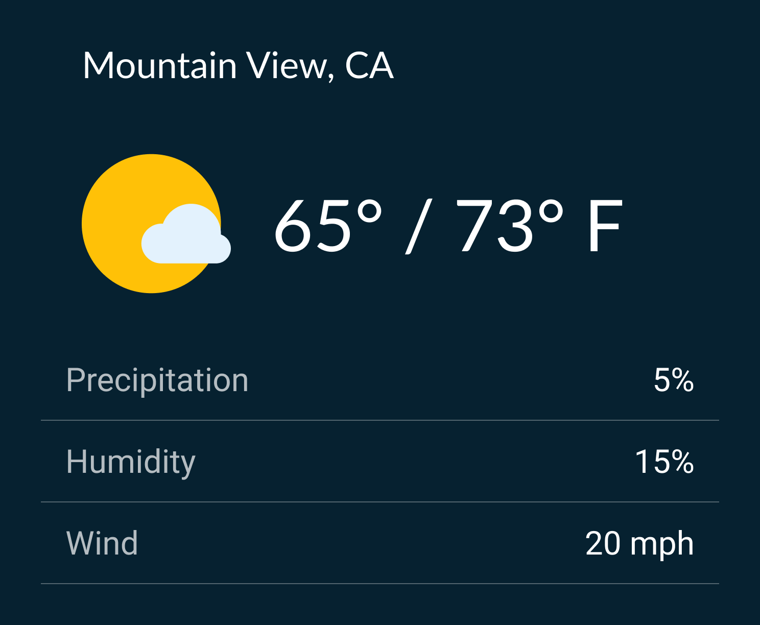
- Header Label + Sublabel
- Image + Label + Sublabel
- Background Image with Alpha channel (transparency) + Label + Sublabel (Either Image or background Image is supported not both)
- List (supports only text based Ignite row - Primary text and Sub Text)
- Background (Color/Gradient)
Card Type 2
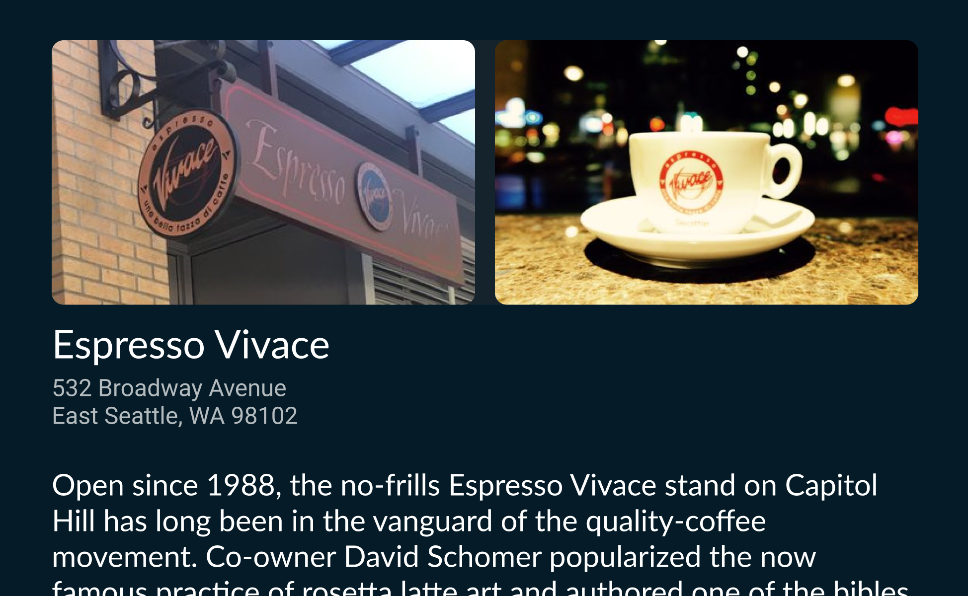
- Image (maximum two)
- Header Text
- Scrollable Text
Guidelines:
- Keep text to 24 characters
- Card background will default to background color while driving
- Background images and colors may be darkened with an opaque overlay to improve text legibility


Used in: Overview, StreamingMap
How to use:
Customize how POIs are displayed on the map
Variations:
What can change:
- Icon/Image
- Text color
- Icon color
- Marker color
Guidelines:
- Text variations should be limited to a maximum of 3 characters
Examples:



Used in: List. The Chooser can be added in Lists. The list can be added to List Details and Pane templates.
How to use:
Entry point to dialog used to change list content with IgniteChooserOptions. The Chooser is used to allow the user to select between multiple options available.
Variations:
Text (Single line)
What can change:
Guidelines:
The Chooser is used as a trigger to access the Chooser Option which will allow the user to select alternate view options.
When a choice has been selected in the Chooser Option and the user confirms their selection, the Chooser will update its label to reflect the choice selected.
Examples:

Used in: IgniteChooser
How to use:
Options to quickly change what is displayed in the list used in the Chooser component.
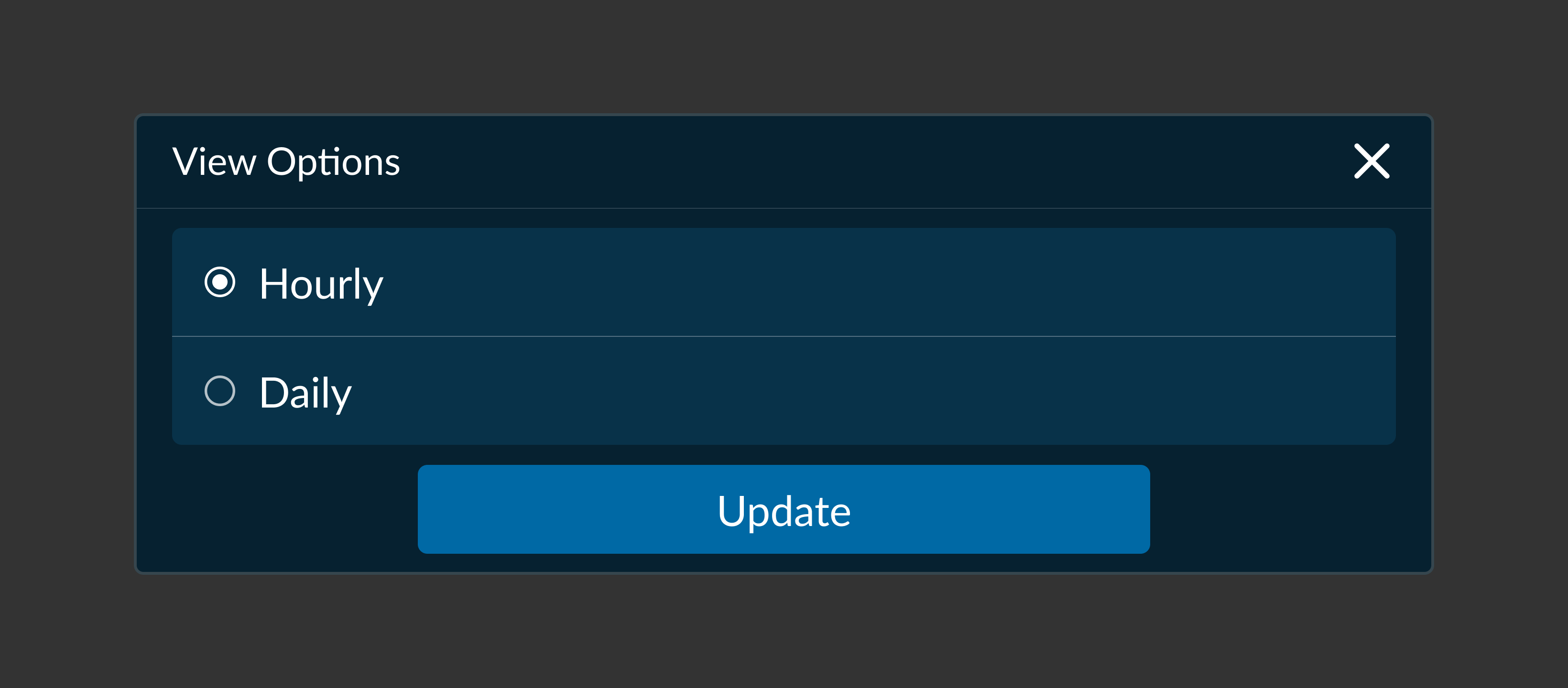
The Chooser Option Dialog can be triggered by the Chooser component. Uses Include:
Selection Options, View Options, Filters, and/or Categories.
Variations:
- Text for Selectable Options (1 or more).
- OK and Cancel Buttons. (Fixed)
What can change:
Guidelines:
- Limit number of Options (Minimum 2 and a Maximum of 5)
- Radio Buttons are system defined and can vary across OEM designs
Examples:
